
By Noah Mallin
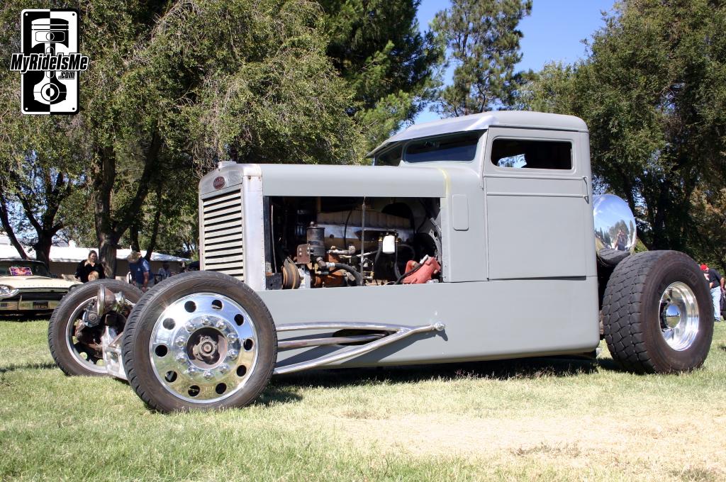
So this is what BMW designers come up with when nobody is around. The GINA, just unveiled (if that's the right term) by the Bavarian company, was actually put together six years ago as an advanced design study by Chris Bangle's team. Yes that is high tech cloth subbing for stiff body panels covering GINA's frame. It can be split down the middle of the "hood" to get to the engine (top photo) and the rear spoiler and doors stretch and bunch the fabric at full extension.
The effect, especially in silver, is a bit Zeppelin-like but fascinating all the same. Designers often try to capture the tension of stretched fabric in sheet metal and Bangle simply eliminates the secondary medium. The solution for the taillights is ingeniously simple. Overall this is a brilliantly visionary design, impractical though it may be.

Wednesday, June 11, 2008
Design: BMW Flashes Their Hot Cloth-Covered GINA -- Six Years Late
Tuesday, April 29, 2008
Design: BMW Pays Homage to Original M

Design Review By Noah Mallin
Back in the 70s car designers all had a big wedge of Gouda on their desks which they used to trace their latest sports car designs. Well not really. But the contrast between BMW's mid 70s Turbo concept (on the right) the original M1 supercar from 1978 (in the middle) and their just revealed M1 Homage (on the left) show that straight lines and creased corners have given way to curves and voluptuous waves.
Also notable is how petite the original looks in contrast to the wide bodied Homage. The Homage cleverly picks up key cues of the original car while morphine them into it's own approach. The rear window louvers and BMW badges at the leading edges of the rear deck, the shape of the sideglass, the prominent seam from the rear quarter windows that flows into the tail and the wheels all nod to the original model.
 Up front, pop-up headlights have given way to low profile lenses tucked into the extended T-shaped mask, which also houses a very brutal interpretation of BMW's grille.
Though it's not a design that will please everyone the detailing and surfacing around the rear flanks is particularly nice and the overall impact of the car is substantial.
The original M1 (above) kicked off BMW's vaunted M division which has since spread out to become the in-house tuning brand for the Bavarian firm.
Friday, April 25, 2008
Design: Happy Earth Day! Peterbilt Based Hot Rod Says "I'm Draining Ur Natchrul Resorcez"
 Stunned Admiration By Noah Mallin
Friday, April 11, 2008
Design: Succesful Sucker Dyson Deigns to Award Aspiring Designers

Dyson, who knows a thing or two about sucking
Report by Noah Mallin
James Dyson, the world's most successful and fey vacuum cleaner salesman/designer and all-around design bon vivant flounced off of the television screen and into New York last night to recognize new innovators with his humbly named Dyson Awards. The task laid out to the contestants was simple: build a better mousetrap. Or as Dyson did, a better vacuum cleaner. As Dyson put it, the winner should demonstrate "...the ability to think differently, persist in the face of set-backs and create functional, innovative products that improve the way we live."
This year's winner came up with something pretty cool that is functional and would be a hit at the local Danceteria. The Reactiv jacket designed by Michael Chen is designed for the urban bicyclist who would prefer not to end up as tartare on the front bumper of a yellow cab.
"The jacket uses an accelerometer that senses movement to change the colour of the LEDs in the back from green (accelerating) to red (braking). It has amber LEDs in the arms which are activated by a tilt switch behind the elbow. These light up when the arm is lifted, indicating the cyclist is about to turn."
Check out other finalists, last years winners, and some info on sucking and/or blowing on Dyson's website.
Wednesday, February 27, 2008
Design: Pininfarina's Sintesi is Future Fantasy From the Past
 Auto show season keeps rolling on with the upcoming Geneva show expected to herald the usual array of production and concept vehicles. Falling squarely into the concept category is famed Italian design house Pininfarina's Sintesi. Pininfarina is famous for it's many iconic Ferrari designs and for it's consultations with Honda among others.
Sintesi is posited as Pininfarina's glimpse into the future as the picture above attests. Still to my eye the emphasis on longer, lower, and wider is a throwback to the design ethos of the 1970s and 80s when aerodynamics became an industry craze. Pininfarina's 1970 Ferrari Modulo is at the extreme of this approach:
As for the merits of the Sintesi design, at first glance what appears to be almost bland and a little bit derivative yields up some very tasty details. The subtle details and converging shapes at the rear flanks are very well handled, as is the indent leading to the lower body side vent. The coupe-like roofline is also notable, along with the huge windshield which seems to have come off of a late-60s Can-Am racer. The front-end opening and the side fender venst seem less harmonious however, and the side glass with its windows-within windows opening also harks back to design studies of the late 70s and early 80s. Also notable are the lovely chamfering around the edges at the front and rear (visible on the picture at the very top of the page).
Why all of these references to 70s and 80s concept design language? Most likely the return to prominence of fuel efficiency as a major issue for global auto manufacturers. The 90s were a time out from escalating fuel prices and in Europe and the United States the evolution of design language towards a lower, longer, "jellybean" like blob began to modify into taller forms like SUV's, crossovers, and tall hatches. Now that fuel prices are back on the rise and countries like the United States are looking again at mandating fuel economy standards, design firms like Pininfarina can be expected to take a second look at these older, more aerodynamic (and thus more fuel efficient as they require less power to move through the air) designs.
Friday, February 8, 2008
Design: Shake it Like a Digital Camera? Polaroid Jettisons Last Vestiges of Instant Photo Biz

Ah, The Polaroid. This was the coolest thing when I was a kid, my family had an awesome Polaroid Land Camera with brown leather-like inserts and sonar (like a friggin' bat!). The whole 70s coked-out aesthetic seemed designed for the harsh unforgiving exposure of Polaroid instant film.
However digital cameras and cell phone cameras etc. have rendered the technology obsolete and Polaroid -- having stopped making the cameras last year -- will wind down film production this year.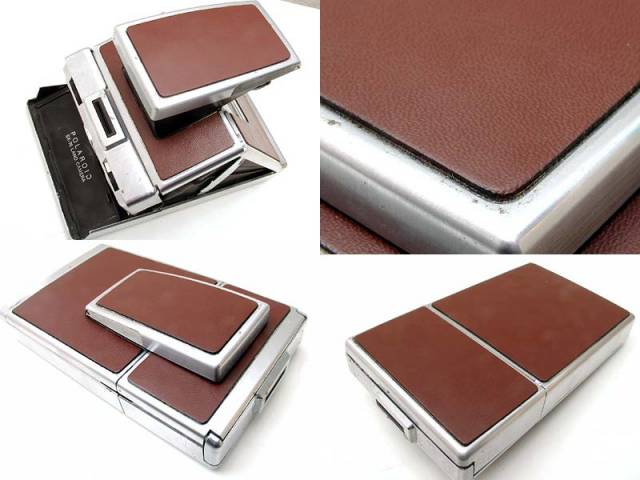
Thursday, February 7, 2008
Design: Finding the Industrial Design Sweet Spot

The Los Angeles Times has an interesting piece today on designer Henry Keck, who's firm designed the iconic Dripcut-Starline sugar dispenser in 1955. Keck says, "Our client was able to retire on the profits from that one thing." The article lays out the methodical way in which Keck and his team assessed the shortcomings of existing dispensers, many of whuich had to do with edges that caused sugar and grime to collect. The end result is instantly pleasing and recognizable.


